Logo Design & Brand Identities
A collection of various logo designs and branding/marketing pieces. Scroll down for a brief description of each project.

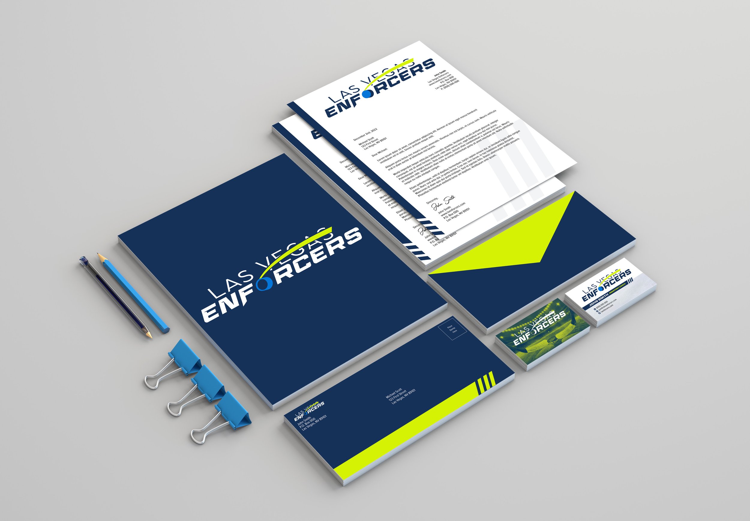
"Las Vegas Enforcers" Stationery Package
Stationery package designed as a part of my Master’s thesis project for the Las Vegas Enforcers, a fictitious hockey team. The package includes professional letterhead and envelope designs featuring a sleek combination of vibrant colors and brand shapes, creating a modern and cohesive look that reflects the team's bold presence on and off the ice.

"Las Vegas Enforcers" Logo Design
Logo design created for a fictitious ECHL team as part of my Master’s thesis project. The puck-like shape as the “O” in the word “Enforcers,” along with the combination of bold colors and dynamic typography adds a touch of athleticism and energy, embodying the fast-paced nature of hockey.

"Relic & Roll Custom Guitars" Logo Design
This logo for Relic & Roll Custom Guitars, designed for a custom guitar painting business, effectively captures the brand’s focus on custom relic work. The rough, textured font mirrors the aged and worn aesthetic often sought in relic finishes, emphasizing the brand’s expertise in creating vintage-inspired designs. The guitar head silhouette subtly reinforces the focus on guitars, while the bold yellow ring adds a striking contrast, ensuring the logo is both eye-catching and memorable. The overall design strikes a balance between modern appeal and a nod to the timeless, handcrafted quality of custom guitar finishes.

"The Center of Music and Art" Business Card Design
This business card design for The Center of Music and Art reflects the brand’s commitment to professionalism and elegance. The minimalistic layout, with its clean lines and balanced use of white space, conveys a sense of sophistication. The gold accents against the black background on one side offer a luxurious feel, while the light background on the other side keeps the design approachable and readable. The prominent logo and subtle use of color ensure that the card is both visually striking and easy to associate with the brand.

"Sam Sara Rose" Logo Design
This logo for Sam Sara Rose, a makeup artist and hair stylist, blends elegance with a touch of the unconventional. The intricate, flowing script font exudes a sense of sophistication and artistry, aligning with the creative services offered. The bold scarab beetle at the center adds an unexpected and unique element, symbolizing transformation and beauty—a fitting representation for a brand in the beauty industry. The vivid green of the beetle contrasts strikingly with the black typography, ensuring the logo is both eye-catching and memorable.

"Rosie's Bakery" Logo Design
Logo design for Rosie’s Bakery in Barnesville, OH. The use of inviting colors and a playful typography creates a visually appealing and memorable logo that effectively communicates the bakery's friendly atmosphere and delicious treats.

"Ghoul Gallery" Logo Design
The logo for Ghoul Gallery perfectly encapsulates the essence of the brand, which specializes in handmade crafts with a horror and spooky theme. Designed to mirror the style of the products, the logo features a striking black and white color scheme, evoking a classic and eerie aesthetic. The blackletter typeface adds a touch of gothic elegance. Encircling the text is an ornamental frame made up of intricately detailed roses, blending beauty with a hint of macabre. This combination of elements creates a logo that is both visually captivating and true to the spirit of Ghoul Gallery.

"Eastern Gateway Alumni Association" Logo Design
This logo for the EGCC Alumni Association blends the logos from the college’s previous identities to create a harmonious, unified representation. It showcases a simplified version of each of the previous logos, symbolizing the history of the college and the enduring connection of the Alumni community with their alma mater.

"Faith in Failure" Logo Design
Logo design for Columbus-based hard rock band, Faith in Failure. Applied to band’s instruments and merchandise items (shirts, stickers, etc.) The use of a strong serif font, coupled with the inclusion of a crow as a symbol, creates a visually captivating and memorable logo that represents the band's intense music and captivating stage presence.

"Faith in Failure" Logo Design
Secondary logo/seal design for Columbus, Ohio-based band, Faith in Failure. Used on various promotional items/merchandise for the band. This logo pays homage to Edgar Allan Poe with a play on words, and a captivating illustration of a crow, reminiscent of the author's iconic poem, "The Raven." The details of the crow combined with bold typography create a striking logo that captures the band's personality.

"Air Benders" Logo Design
Logo design for Air Benders Ariel Studio. The logo embodies grace and fluidity. It features a sleek and dynamic representation of a dancer suspended in mid-air, elegantly contorting their body with the aerial silks, creating a captivating visual that captures the studio's focus on artistic movement and awe-inspiring aerial performances.

"HundoSavage Twitch" Logo Design
Logo design for Twitch Streamer “HundoSavage.” The client is a recruiter for the Air Force and wanted to incorporate some imagery from the Air Force into the logo, as well as his love for OSU. The logo captures his unique identity as a gaming enthusiast with a military background, while also paying homage to the Ohio State University by utilizing their color palette.

"Terry Hancock Photography" Logo Design
Logo for a photographer, Terry Hancock. This logo showcases a timeless and minimalistic design. It features sans-serif typography in varying weights, complemented by geometric elements, creating a clean and contemporary logo that emphasizes the photographer's dedication to capturing moments with precision and artistic simplicity. The goal for this logo was to be simple enough to be used as a watermark.
